# AI implementation instructions

> Import and use real Marwes components from `@marwes-ui/svelte`.
> Do not invent `mw-*` replacement components or custom elements; use the adapter's documented public exports.

Svelte 5 components for the Marwes design system with default styling, typed theme tokens, accessibility contracts, and AI-readable semantics.

<div align="center">

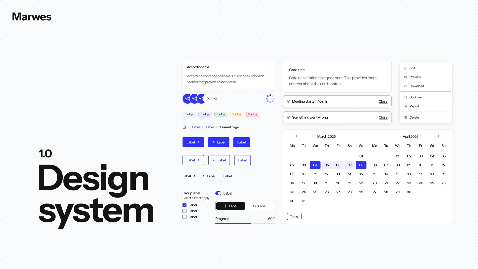
<img alt="Marwes Design System" src="https://raw.githubusercontent.com/niklas-westman/marwes/main/.github/assets/cover-v3.png" width="100%" style="border-radius: 40px;">

<br>
<br>

# Marwes Design System - Svelte

**Svelte 5 components with default Marwes styling, typed theme tokens, accessibility contracts, and AI-readable semantics built in.**

Svelte 5 • TypeScript-first • Default CSS included • ThemeInput • Google Fonts DX • Purpose components

[**marwes.io**](https://marwes.io) — official site, theme builder, and install guides
[Svelte Storybook](https://storybook-svelte.marwes.io/latest/) • [Documentation](https://github.com/niklas-westman/marwes/tree/main/docs) • [GitHub](https://github.com/niklas-westman/marwes)

</div>

---

## Why Use It

Marwes gives Svelte apps a ready design-system base without requiring custom CSS setup or local component forks.

- **One package for Svelte apps**: components, provider, default preset CSS, theme helpers, and typed props.
- **Svelte-native binding**: common controls support `bind:value` and `bind:checked` while preserving Marwes semantic contracts.
- **Runes-first**: built entirely on Svelte 5 runes (`$props`, `$state`, `$derived`, `$effect`, `$bindable`) — no legacy stores or lifecycle hooks.
- **Consequential theming**: a `ThemeInput` object changes colors, fonts, radius, density, typography, and component visuals through shared CSS variables.
- **Purpose components**: `SubmitButton`, `CancelButton`, and `DestructiveButton` make intent machine-readable so tests, audits, and AI agents can handle actions safely.
- **Shared core contracts**: every Svelte component is backed by the same framework-agnostic recipes, a11y mapping, and theme shape used across adapters.

## Package Map

For a Svelte app, install this package first. It includes the Svelte adapter, loads the default preset CSS, and re-exports the core theme helpers you normally need.

| Package | Use it when |
| --- | --- |
| `@marwes-ui/svelte` | You are building a Svelte app. |
| `@marwes-ui/react` | You are building a React app instead. |
| `@marwes-ui/vue` | You are building a Vue app instead. |
| `@marwes-ui/core` | You are building adapters, tests, tooling, or framework-agnostic integrations. |
| `@marwes-ui/presets` | You need standalone preset CSS or preset theme exports. |

This split keeps installation simple for app teams while giving humans and AI agents clear package boundaries: adapters render, core defines contracts, presets style.

## Requirements

- Svelte 5.20 or newer
- Node.js 20 or newer for package installation, application builds, and the CLI
- A modern browser with CSS custom-property support
- A Vite starter layout for automatic provider patching; custom layouts use the printed manual setup

## Install

The Marwes CLI is the official installation path. It installs `@marwes-ui/svelte` (with `svelte` as a peer), wraps your app root with `MarwesProvider`, and leaves you ready to render components with default Marwes styling — no separate CSS setup.

For full setup guides, theme customization, and the theme builder, visit [marwes.io](https://marwes.io).

### Existing Svelte app

Run at the root of your project:

```bash
pnpm dlx @marwes-ui/cli init --adapter svelte
```

Also works with `npx @marwes-ui/cli`, `yarn dlx @marwes-ui/cli`, and `bunx @marwes-ui/cli`.

Verify the patched app and its production build:

```bash
pnpm dlx @marwes-ui/cli doctor --run-build
```

Automatic provider patching supports known Vite starter layouts. A `manual-action-required` result means the package was installed but the CLI could not safely identify the app root; apply the complete provider example printed by the CLI and rerun the doctor command.

### New Vite app

Scaffold a fresh Vite starter with Marwes preinstalled:

```bash
pnpm create marwes@latest my-app --template svelte-ts
```

### AI-assisted setup

Add `--agentic` to hand setup to an AI coding agent (Claude Code, Cursor, etc.). The CLI runs the normal install, then runs `doctor` and prints the guardrails the agent should follow:

```bash
pnpm dlx @marwes-ui/cli init --adapter svelte --agentic
```

After install, jump to the [Quick Start](#quick-start) below.

## Quick Start

```svelte
<script lang="ts">
  import {
    Button,
    ButtonVariant,
    CheckboxField,
    EmailField,
    MarwesProvider,
    SubmitButton,
  } from "@marwes-ui/svelte"
</script>

<MarwesProvider>
  <EmailField label="Email" input={{ placeholder: "you@example.com" }} />
  <CheckboxField label="Subscribe" />
  <Button variant={ButtonVariant.secondary}>Preview</Button>
  <SubmitButton>Save</SubmitButton>
</MarwesProvider>
```

## Style App-Owned UI

Marwes components pick up provider tokens automatically. Your own Svelte styling can use the same tokens through scoped styles, global CSS, or `mwThemeVars` in script-driven style objects.

```svelte
<script lang="ts">
  import { Button, ButtonVariant, MarwesProvider, mwThemeVars } from "@marwes-ui/svelte"

  const panelStyle = `
    padding: ${mwThemeVars.spacing.sp24};
    background: ${mwThemeVars.color.surface};
    color: ${mwThemeVars.color.text};
    border: 1px solid ${mwThemeVars.color.border};
    border-radius: ${mwThemeVars.ui.radius};
  `
</script>

<MarwesProvider>
  <main class="app-shell">
    <aside class="primary-callout">Launch workspace</aside>
    <section style={panelStyle}>
      <Button variant={ButtonVariant.primary}>Save</Button>
    </section>
  </main>
</MarwesProvider>

<style>
  .app-shell {
    min-height: 100dvh;
    padding: var(--mw-spacing-sp-24);
    color: var(--mw-color-text);
    background: var(--mw-color-background);
  }

  .primary-callout {
    background: var(--mw-color-primary-base);
    color: var(--mw-color-primary-label);
  }
</style>
```

## Use Typed Components

Import components, enums, and prop types from the same package. The values line up with the same core recipes and preset CSS.

```svelte
<script lang="ts">
  import {
    BadgeVariant,
    Button,
    ButtonSize,
    ButtonVariant,
    Card,
    H1,
    InputField,
    Paragraph,
    Spacer,
    Spacings,
    StatusBadge,
    SubmitButton,
    type ButtonProps,
    type H1Props,
    type InputFieldProps,
    type ParagraphProps,
  } from "@marwes-ui/svelte"
</script>

<Card title="Project setup">
  <StatusBadge variant={BadgeVariant.success}>Ready</StatusBadge>
  <Spacer spacing={Spacings.sp16} />
  <H1 size="h2">Launch workspace</H1>
  <Paragraph size="md">
    Components share theme tokens, typed variants, spacing, and semantic metadata.
  </Paragraph>
  <InputField
    label="Email"
    helperText="Used for project notifications."
    input={{ type: "email", placeholder: "you@example.com" }}
  />
  <Spacer spacing={Spacings.sp24} />
  <Button variant={ButtonVariant.primary} size={ButtonSize.md}>Create project</Button>
  <SubmitButton>Save changes</SubmitButton>
</Card>
```

For icon-only actions, use `IconButton` and name the button with `label`, `ariaLabel`, or `ariaLabelledBy`. An `ariaLabel` on a nested `Icon` names the image, not the interactive button.

<!-- BEGIN GENERATED PUBLIC COMPONENTS -->
## Available Components

Generated from the public root export of `@marwes-ui/svelte`. Do not edit this inventory by hand.

### Framework

- `MarwesProvider`, `SkipLink`

### Accordion

- `AccordionField`, `FAQAccordion`, `SectionsAccordion`, `SettingsAccordion`

### Avatar

- `Avatar`, `AvatarBadge`, `AvatarGroup`, `PresenceAvatar`, `ProfileAvatar`, `TeamAvatarGroup`

### Badge

- `Badge`, `BadgeGroup`, `NotificationBadge`, `PriorityBadge`, `StatusBadge`

### Banner

- `Banner`, `ErrorBanner`, `InfoBanner`, `SuccessBanner`, `WarningBanner`

### Breadcrumb

- `Breadcrumb`

### Button

- `Button`, `CancelButton`, `CloseButton`, `ConfirmButton`, `CopyButton`, `CreateButton`
- `DestructiveButton`, `DownloadButton`, `DropdownButton`, `EditButton`, `FilterButton`, `IconButton`
- `LinkButton`, `PrimaryButton`, `RefreshButton`, `SaveButton`, `SearchButton`, `SecondaryButton`
- `SortButton`, `SubmitButton`, `SuccessButton`, `TextButton`, `UploadButton`, `VerifyButton`

### Card

- `Card`, `ProductCard`, `ProfileCard`, `StatCard`

### Checkbox

- `CheckboxField`, `CheckboxGroupField`

### Context Menu

- `ContextMenu`

### Date Picker

- `DatePickerField`

### Dialog

- `ConfirmDialog`, `DestructiveDialog`, `Dialog`, `DialogModal`, `InfoDialog`

### Divider

- `Divider`

### Drawer

- `Drawer`

### Heading

- `H1`, `H2`, `H3`

### Icon

- `Icon`

### Input

- `CurrencyField`, `DateOfBirthField`, `DropdownField`, `EmailField`, `InputField`, `InputOtpField`
- `PasswordField`, `PhoneField`, `RichTextField`, `SearchField`, `SelectField`, `TextareaField`
- `URLField`, `ZipCodeField`

### Pagination

- `PaginationField`

### Paragraph

- `Paragraph`

### Progress Bar

- `ProgressBar`

### Radio

- `OptionRadioGroup`, `RadioGroupField`, `RatingRadioGroup`, `YesNoRadioGroup`

### Segmented Control

- `SegmentedControlField`

### Skeleton

- `Skeleton`

### Slider

- `BrightnessSlider`, `RadiusSlider`, `SliderField`, `VolumeSlider`

### Spacing

- `Spacer`, `Spacing`

### Spinner

- `ButtonSpinner`, `EmptyStateSpinner`, `Spinner`

### Stat Tile

- `StatTile`

### Switch

- `FeatureToggle`, `PermissionSwitch`, `PreferenceSwitch`, `SwitchField`

### Tab

- `ContentTabs`, `NavigationTabs`, `SettingsTabs`, `Tab`, `TabGroup`, `TabPanel`

### Text

- `Text`, `TypographyText`

### Toast

- `ErrorToast`, `InfoToast`, `SuccessToast`, `Toast`, `ToastContainer`, `ToastProvider`
- `WarningToast`

### Tooltip

- `Tooltip`, `TooltipGroup`

<!-- END GENERATED PUBLIC COMPONENTS -->

## Theme In Seconds

The default Marwes theme is already active. If you already have a good-looking design library or brand system, pass a small typed `ThemeInput` override instead of rebuilding component CSS.

```svelte
<script lang="ts">
  import { MarwesProvider, mwAvailableFonts, type ThemeInput } from "@marwes-ui/svelte"

  const brandTheme = {
    color: {
      primary: "#2457FF",
      danger: "#D90429",
      success: "#15803D",
      warning: "#D97706",
      background: "#F8FAFC",
      surface: "#FFFFFF",
      surfaceElevated: "#FFFFFF",
      text: "#111827",
      textMuted: "#4B5563",
      border: "#D1D5DB",
      focus: "#2457FF",
    },
    font: {
      primary: mwAvailableFonts.Poppins,
      secondary: mwAvailableFonts.Lora,
    },
    ui: {
      radius: 10,
      density: "comfortable",
    },
  } satisfies ThemeInput
</script>

<MarwesProvider theme={brandTheme}>
  <slot />
</MarwesProvider>
```

The provider resolves `ThemeInput` into `--mw-*` CSS variables. Preset CSS consumes those variables across the full component system.

Marwes is designed to look great from the beginning. Start with the default preset, then override only the colors, fonts, radius, or density that belong to your product. Unspecified values keep the polished Marwes defaults.

## Light And Dark Mode

MarwesProvider can own the active mode for the app. Use `ThemeMode.light` and `ThemeMode.dark` instead of string literals, then read or change the active mode with `useThemeMode()` anywhere under the provider. Every component under the provider receives the matching `--mw-*` variables and `mw-theme--light` / `mw-theme--dark` class.

```svelte
<script lang="ts">
  import { Button, ButtonVariant, ThemeMode, useThemeMode } from "@marwes-ui/svelte"

  const { mode, toggleMode } = useThemeMode()
</script>

<Button variant={ButtonVariant.secondary} onclick={toggleMode}>
  Use {mode === ThemeMode.dark ? ThemeMode.light : ThemeMode.dark} mode
</Button>
```

```svelte
<script lang="ts">
  import { MarwesProvider, ThemeMode } from "@marwes-ui/svelte"
</script>

<MarwesProvider defaultMode={ThemeMode.light}>
  <slot />
</MarwesProvider>
```

`defaultMode` sets the initial uncontrolled mode. `toggleMode()` updates the provider, so Marwes components, preset CSS, and custom app styles that use `--mw-*` variables all move together without duplicating local theme state.

### System And Persisted Preference

`mode` is always the rendered visual mode: `ThemeMode.light` or `ThemeMode.dark`. `preference` is the app or user choice: `ThemeMode.light`, `ThemeMode.dark`, or `"system"`. Use `preference` and `defaultPreference` when your UI needs a system option; keep using `mode`, `defaultMode`, and `onModeChange` when you only need concrete light/dark compatibility.

```svelte
<script lang="ts">
  import { Button, ButtonVariant, ThemeMode, useThemeMode } from "@marwes-ui/svelte"

  const { mode, preference, systemMode, isSystem, setPreference, setMode } = useThemeMode()
</script>

<p>Rendering {mode}; preference is {preference}; system is {systemMode}.</p>
<Button variant={ButtonVariant.secondary} onclick={() => setPreference("system")}>
  Use system
</Button>
<Button variant={ButtonVariant.secondary} onclick={() => setMode(ThemeMode.dark)}>
  Use dark
</Button>
{#if isSystem}
  <span>Following system</span>
{/if}
```

```svelte
<script lang="ts">
  import { MarwesProvider } from "@marwes-ui/svelte"
</script>

<MarwesProvider defaultPreference="system" storageKey="marwes-theme" enableSystem>
  <slot />
</MarwesProvider>
```

`useThemeMode().mode` never returns `"system"`; it is always the concrete mode Marwes rendered. `useThemeMode().preference` returns the active app/user preference, and `setPreference("system")` is the system-capable setter. `setMode(mode)` remains a concrete light/dark convenience.

`storageKey` is opt-in and defaults to `false`. Storage reads and writes are failure-safe, so private browsing or unavailable storage will fall back to normal provider state. `enableSystem` defaults to `true`; set it to `false` to avoid `matchMedia` detection and resolve `"system"` through the light fallback.

### Root Target Sync

By default Marwes keeps theme state scoped to the provider element. If your app shell also needs the resolved mode on `html` or `body`, set `target` and `attribute`:

```svelte
<MarwesProvider
  defaultPreference="system"
  storageKey="marwes-theme"
  target="html"
  attribute="class"
  disableTransitionOnChange
>
  <slot />
</MarwesProvider>
```

`target` can be `"provider"`, `"html"`, or `"body"`. `attribute` can be `"class"`, `"data-theme"`, or `"data-mode"`. Class mode only adds the active `light` / `dark` class and removes the opposite one; unrelated classes are preserved.

### SvelteKit SSR

Use `createMarwesThemeStyle()` and `createMarwesThemeScript()` when a server-rendered app needs the correct light or dark variables before hydration. Both helpers are available from the adapter root:

```ts
import { createMarwesThemeScript, createMarwesThemeStyle } from "@marwes-ui/svelte"
```

Read the [theme SSR no-flash guide](https://github.com/niklas-westman/marwes/blob/main/docs/guides/theme-ssr-no-flash.md) for SvelteKit setup, CSP nonces, custom light/dark themes, and stored/system preference behavior.

## Custom Styling Tokens

`MarwesProvider` resolves `ThemeInput` into `--mw-*` CSS variables. Marwes components and preset CSS consume those variables automatically. The custom styling token helpers let app-owned Svelte styles use the same provider-scoped values.

Svelte style blocks can consume provider variables directly:

```svelte
<style>
  .panel {
    padding: var(--mw-spacing-sp-24);
    color: var(--mw-color-text);
    background: var(--mw-color-surface);
    border-radius: var(--mw-ui-radius);
  }
</style>
```

For script-driven style objects, import the core helpers:

- `mwThemeVars` returns CSS `var(...)` references for inline styles and config files.
- `mwThemeVarNames` returns raw custom property names for assigning provider-scoped overrides.
- `mwVar()` wraps custom `--mw-*` names when the named token object does not cover a case.

```ts
import { mwThemeVarNames, mwThemeVars, mwVar } from "@marwes-ui/svelte"

const panelStyle = `
  padding: ${mwThemeVars.spacing.sp24};
  color: ${mwThemeVars.color.text};
  outline-color: ${mwVar("--mw-color-focus", "#2457FF")};
`
```

`mwTheme`, `mwStyledTheme`, and `mwThemeVars` contain CSS `var(--mw-*)` references, not resolved color or spacing values. They are correct inside CSS evaluated below `MarwesProvider`, but JavaScript reads or aliases can resolve against the wrong element and return an empty value. Use `useTheme()` for JavaScript logic, charts, runtime aliases, or bridges that need concrete values.

Keep the APIs separate:
- Use `Spacings.sp24` for Marwes spacing props such as `<Spacer spacing={Spacings.sp24} />`.
- Use `mwThemeVars.spacing.sp24` for custom CSS values.
- Use `mwThemeVarNames.spacing.sp24` when assigning or inspecting a CSS custom property name.
- Use `useTheme()` when Svelte logic needs resolved runtime values such as `"#2457FF"`.

## Svelte Binding Conventions

- Text-like controls support `bind:value` through `$bindable()`.
- Checkboxes support `bind:checked` and `oncheckedchange`.
- Switches fire `oncheckedchange` callbacks.
- Dialog modals support `bind:open` for two-way open state.
- Snippets replace React render props — use `{#snippet footer({ close })}...{/snippet}` for dialog footers and similar patterns.

Prefer `bind:` in normal Svelte app code unless you specifically need callback-style wiring.

## Google Fonts DX

Most Google Font use cases only need `mwAvailableFonts`; no `fontLoading` prop is needed.

```svelte
<script lang="ts">
  import { MarwesProvider, mwAvailableFonts, type ThemeInput } from "@marwes-ui/svelte"

  const fontTheme = {
    font: {
      primary: mwAvailableFonts.Poppins,
      secondary: mwAvailableFonts.Lora,
    },
  } satisfies ThemeInput
</script>

<MarwesProvider theme={fontTheme}>
  <slot />
</MarwesProvider>
```

For self-hosted or licensed fonts, use `BrandSans`, `BrandSerif`, `BrandMono`, or `createFontStack()`.

## Purpose Components

Prefer purpose components for common actions. They lock UX intent and emit AI-readable metadata, so the component is not just "a button with red styling" but a known action with known risk.

```svelte
<script lang="ts">
  import {
    CancelButton,
    CreateButton,
    DestructiveButton,
    SubmitButton,
  } from "@marwes-ui/svelte"
</script>

<CancelButton>Cancel</CancelButton>
<CreateButton>Create</CreateButton>
<SubmitButton>Save</SubmitButton>
<DestructiveButton>Delete</DestructiveButton>
```

That matters for agentic workflows. A human, test, or AI agent can inspect the DOM and see that a destructive button requires confirmation before activation:

```html
<button
  data-component="button"
  data-purpose="destructive"
  data-action="delete"
  data-destructive="true"
  data-confirmation-required="true"
>
  Delete
</button>
```

An agent can then follow a safer rule: if `data-confirmation-required="true"`, ask the user before clicking. A test can assert the same behavior without guessing from the label "Delete" or from a red color.

## Why It Is Accessible

Marwes Svelte components are accessible because the adapter renders a shared core contract, not because each component hand-rolls ARIA in isolation.

- Core recipes produce typed `a11y` output for roles, labels, described-by wiring, invalid state, disabled state, and semantic metadata.
- Svelte components prefer native DOM controls first: `button`, `input`, `select`, `textarea`, `hr`, and standard form wiring.
- Field components connect visible labels, helper text, and errors through `id`, `for`, `aria-describedby`, `aria-invalid`, and polite error announcements.
- Coordinated widgets carry explicit contracts: tabs wire `tablist`/`tab`/`tabpanel`, dialogs own dialog semantics, toasts expose live-region behavior, and purpose buttons expose risk metadata.
- Storybook accessibility smoke checks run through the Storybook a11y addon for the promoted Svelte families, and shared contract tests keep Svelte aligned across adapters.

Example:

```svelte
<script lang="ts">
  import { InputField } from "@marwes-ui/svelte"
</script>

<InputField
  label="Email"
  helperText="Used for receipts."
  error="Enter a valid email."
  input={{ type: "email", placeholder: "you@example.com" }}
/>
```

That contract resolves to DOM wiring like:

```html
<label for="email">Email</label>
<input
  id="email"
  type="email"
  aria-describedby="email-helper email-error"
  aria-invalid="true"
>
<p id="email-helper">Used for receipts.</p>
<p id="email-error" aria-live="polite">Enter a valid email.</p>
```

The important part is that the same label, helper, error, and invalid contract is tested at the shared contract layer and then applied by the Svelte adapter.

## Package Boundaries

- `@marwes-ui/core` owns recipes, theme resolution, a11y mapping, and semantic metadata.
- `@marwes-ui/presets` owns default preset CSS.
- `@marwes-ui/svelte` owns Svelte rendering and provider behavior.

## Scripts

```bash
pnpm --filter @marwes-ui/svelte build
pnpm --filter @marwes-ui/svelte test:typecheck
pnpm --filter @marwes-ui/svelte test
```

## Related Docs

- [Docs index](https://github.com/niklas-westman/marwes/tree/main/docs)
- [Svelte adapter guide](https://github.com/niklas-westman/marwes/blob/main/docs/guides/svelte-adapter.md)
- [Architecture](https://github.com/niklas-westman/marwes/blob/main/docs/reference/architecture.md)
- [Figma to Marwes](https://github.com/niklas-westman/marwes/blob/main/docs/guides/figma-to-marwes.md)
